Consolidating the strategy and refreshing the identity for one of Canada’s most signficant student housing developments.
ClientForum & Campus Suites
TypeStudent Living
Services Strategy, Visual Identity, Website Design
Location
Toronto, Canada
When it opened in September 2017, Quad set a new benchmark for student living in Canada. With more than 800 beds across two buildings, Quad benefited from an exceptional location on York University’s sprawling campus, at Toronto’s northern edge, and from an elevated offering that stood out against the school’s aging accommodations. The buildings, which are owned by Campus Suites and Forum Asset Management— Canada’s pre-eminent owner and developer of purpose-built student accommodations—filled quickly, generating waitlists.
In 2025, with phase two construction underway, ownership asked StudioDA to consolidate and elevate the brand. Despite exceptional year-over-year performance, Quad faced impending competition from highly amenitized, off-campus offerings; and a sweeping decline in international student enrollment.
Through a comprehensive audit, we identified a beloved brand with an underdeveloped and inconsistent expression. The opportunity was evolution, not revolution: We leveraged existing equity, and ensuring the brand remained intuitive and legible to Quad’s loyal community.

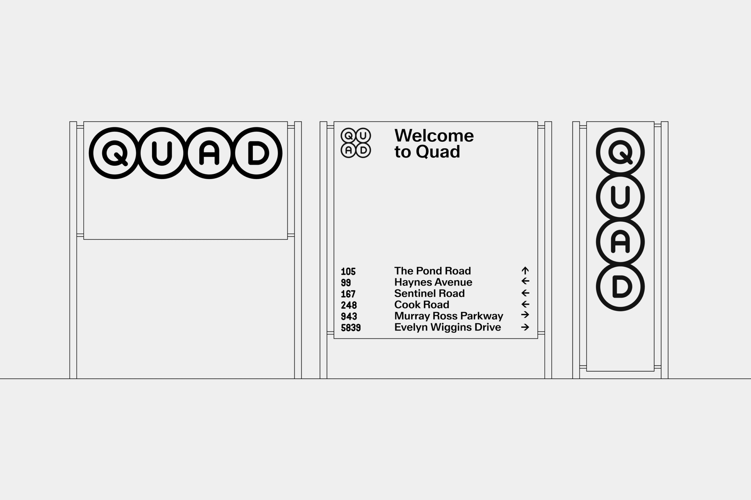
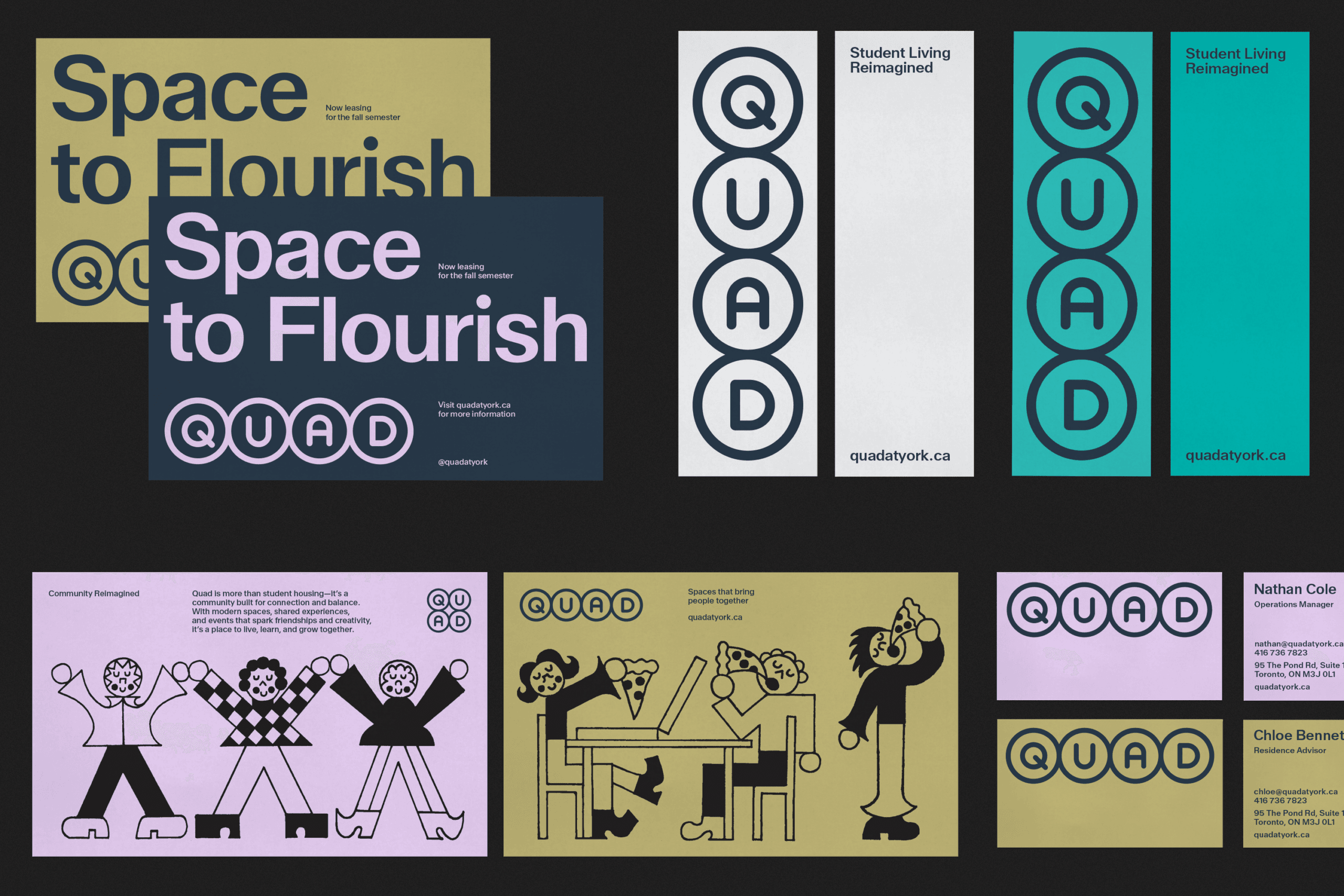
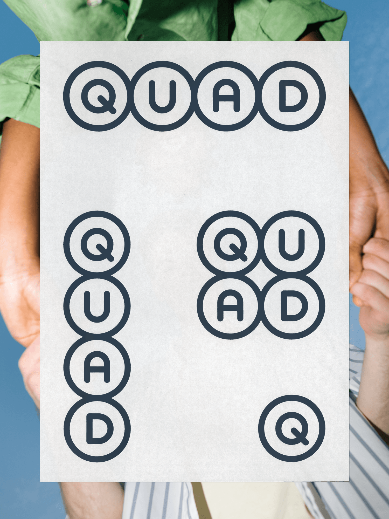
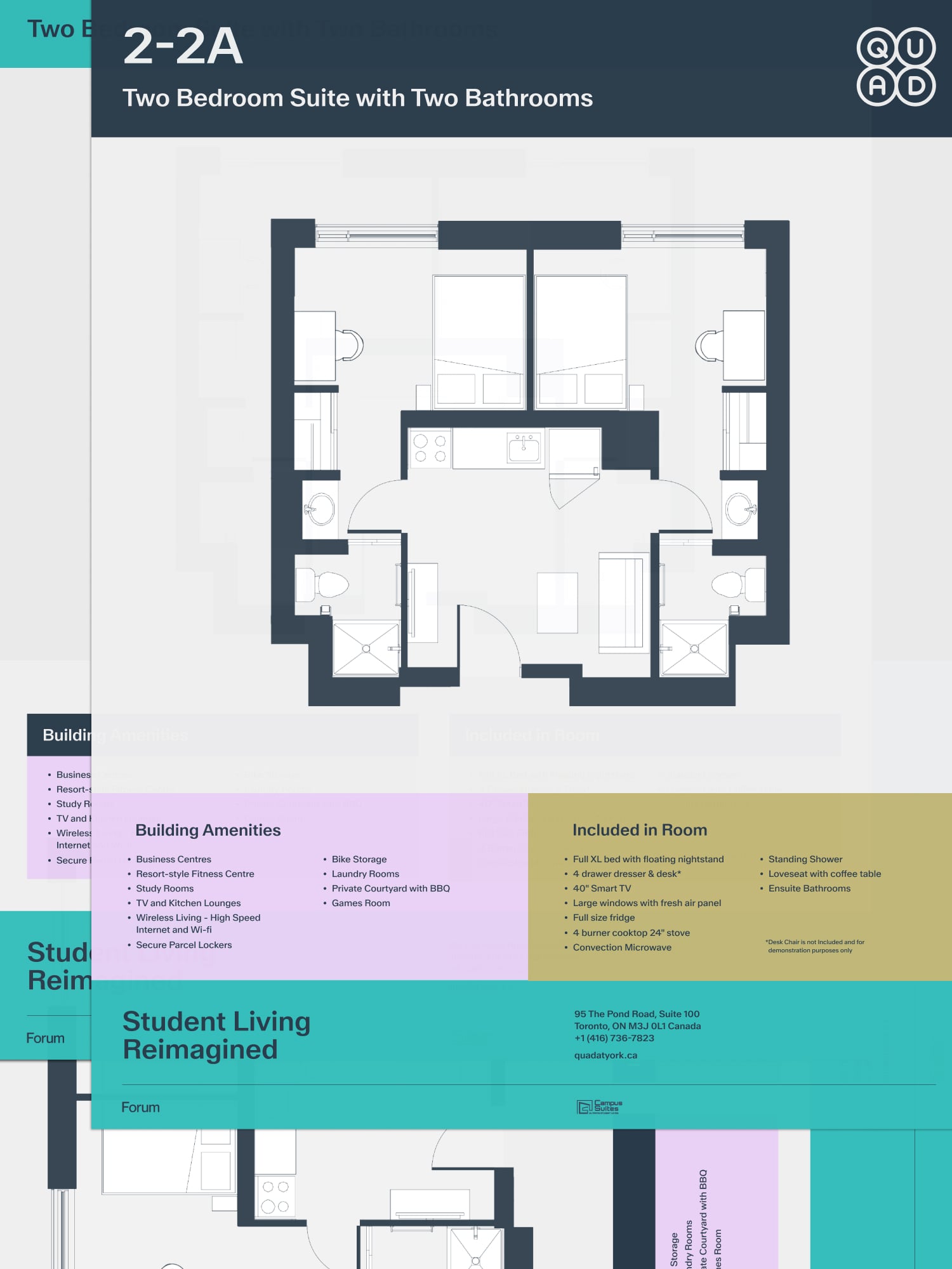
We identified that, with its promise of community in a safe, design-forward environment, Quad’s promise to residents is space to flourish. Building on this strategy, we refreshed the property’s rounded wordmark, refining the proportions and weight to create an elevated but inviting identity. We developed a supporting shape system, which functions both as a graphic device and as an imagery container; and we developed a custom number set to support signage and wayfinding applications. We commissioned a set of illustrations from acclaimed Montreal artist Mathieu Labrecque, and we built a library of vibrant, dynamic photography.
From there, we supported a robust brand rollout, designing a new website to function as both a marketing and a sales conversion tool. We rolled out new signage applications, integrating the new branding seamlessly with legacy artefacts, which will be updated over time.
To ensure consistent brand expression on property, we worked closely with the operations team, equipping them with a user-friendly brand toolkit. Today, with Canadian universities facing enduring enrollment challenges, Quad continues to outperform, reflecting the reality that its accommodations aren’t merely a commodity but a lifestyle choice; a differentiated offering that reflects not only what residents need, but who they wish to become.
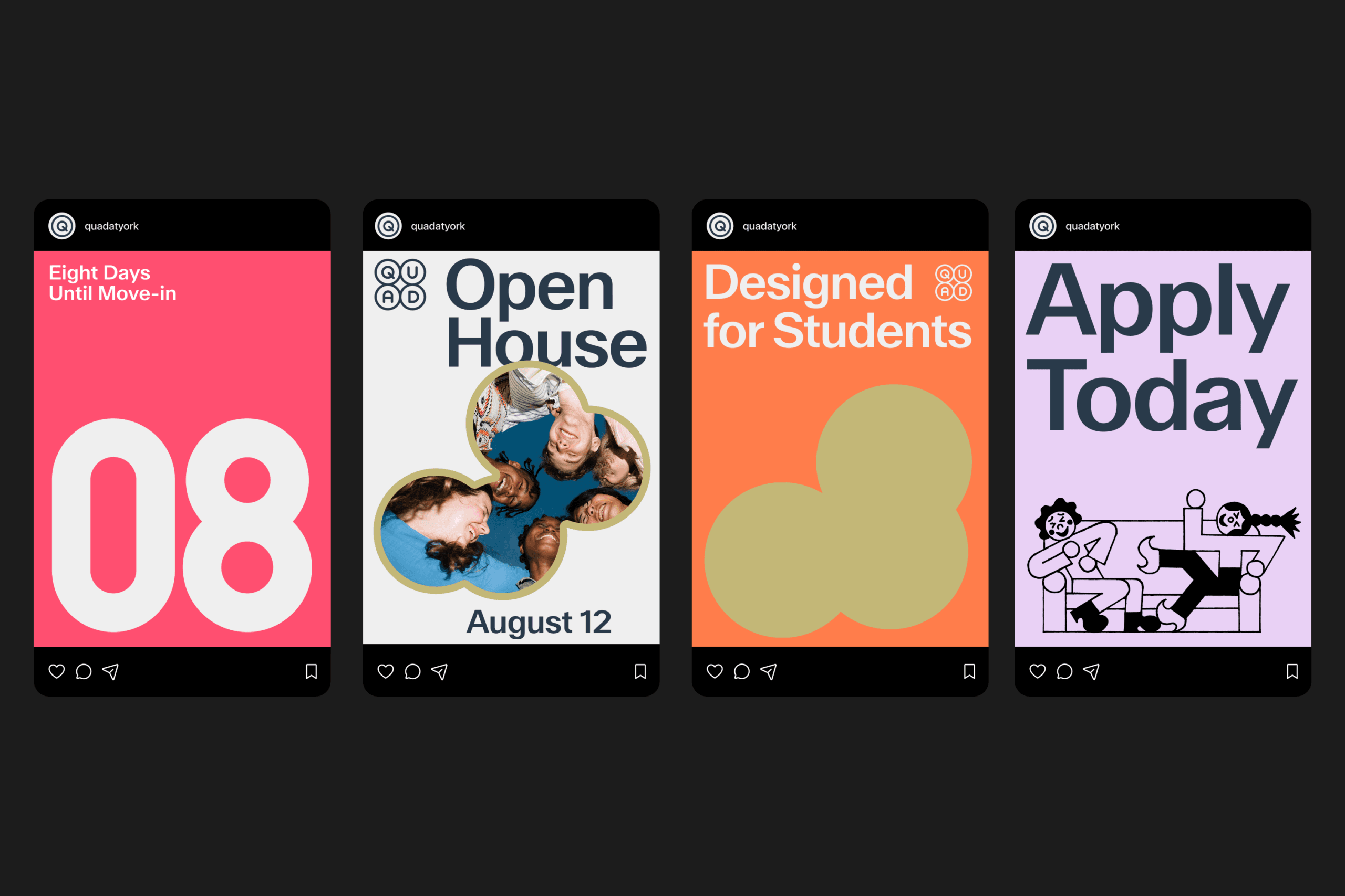
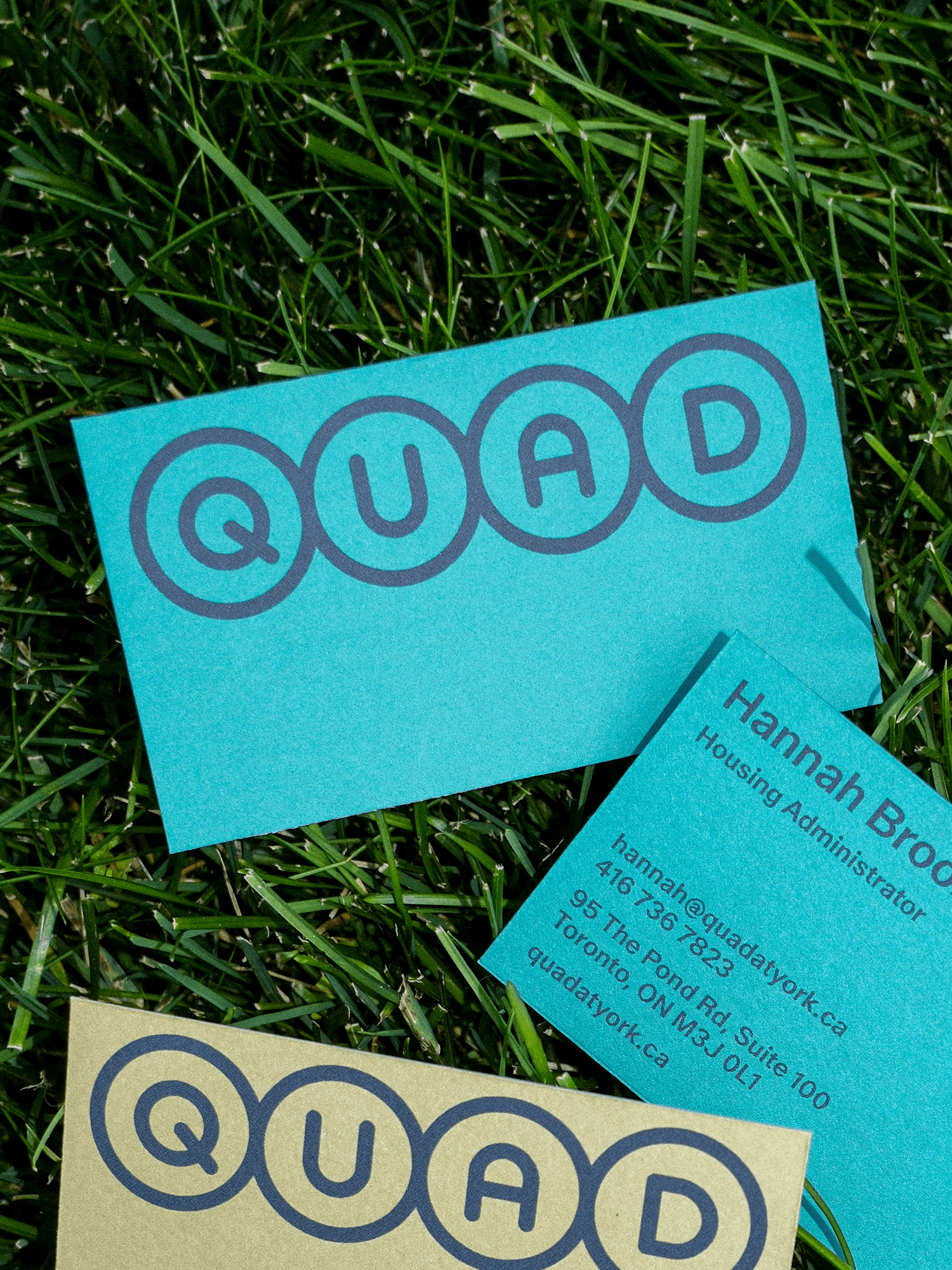
Quad was a beloved brand with an underdeveloped and inconsistent expression. The opportunity was evolution, not revolution.
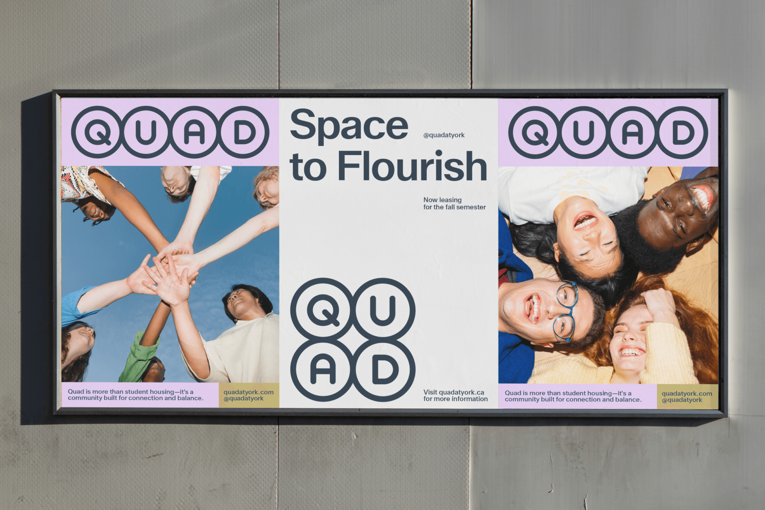
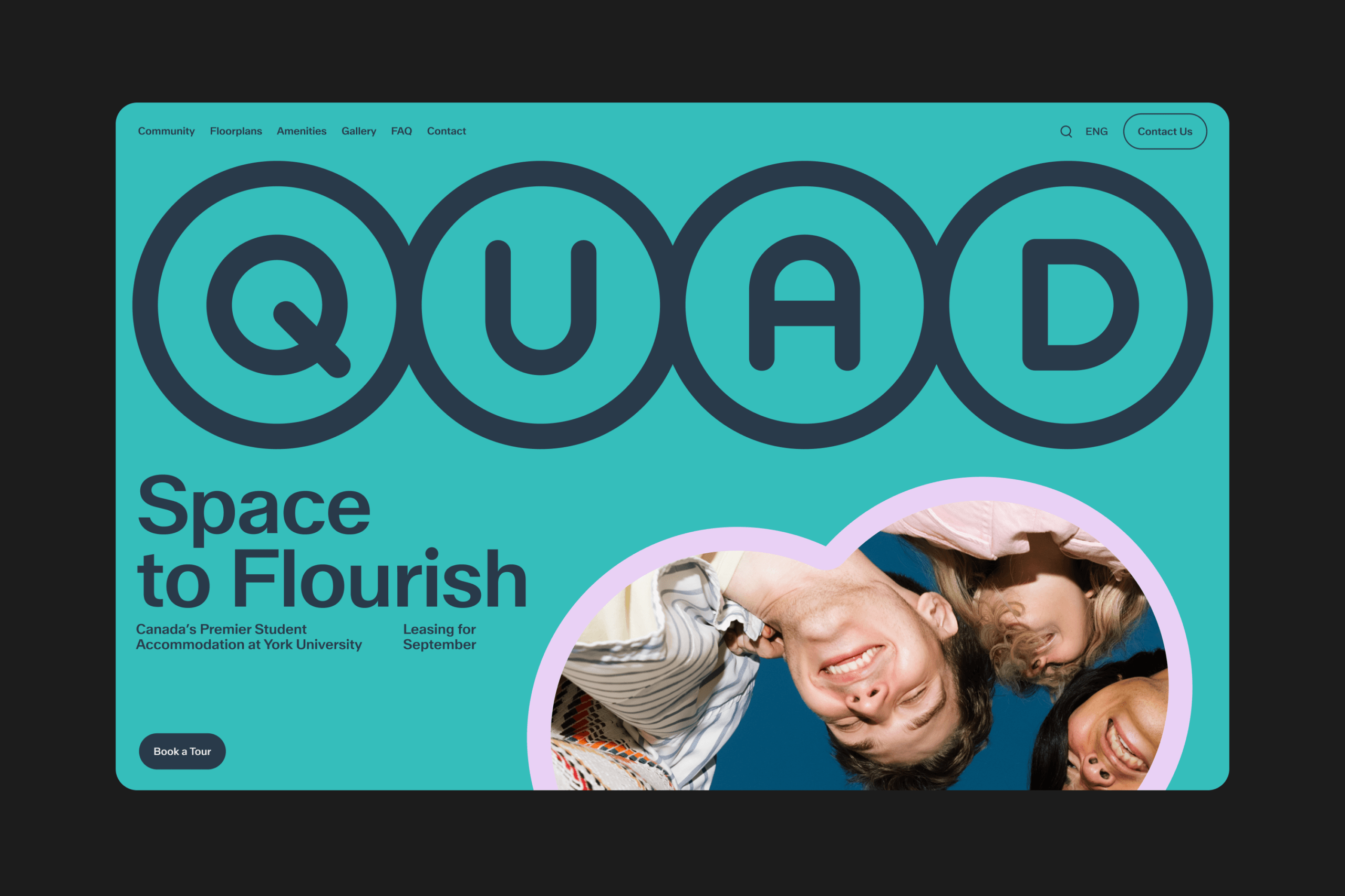
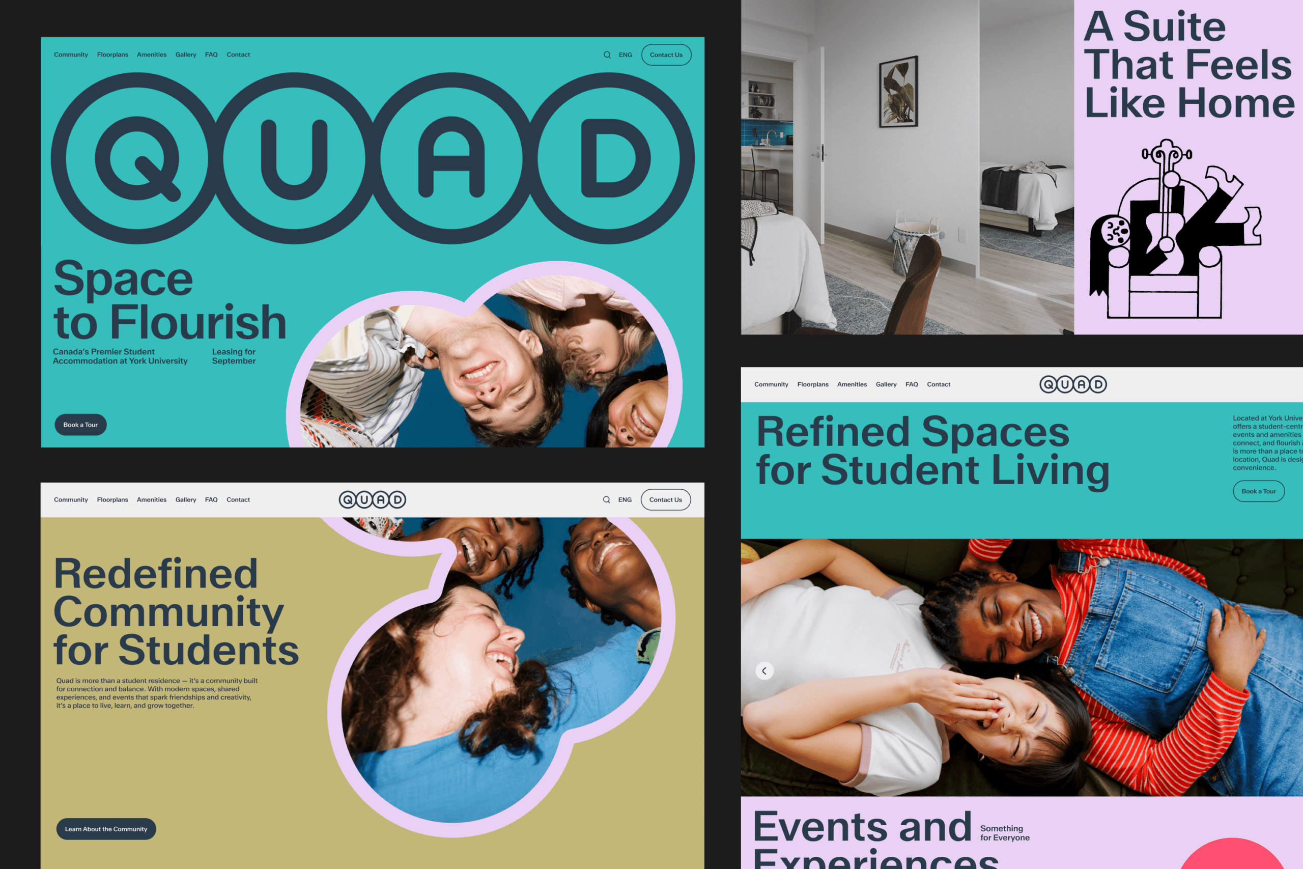
We worked with the legacy visual identity, reimagining the distinctive circles as the foundation for a contemporary, geometric system.

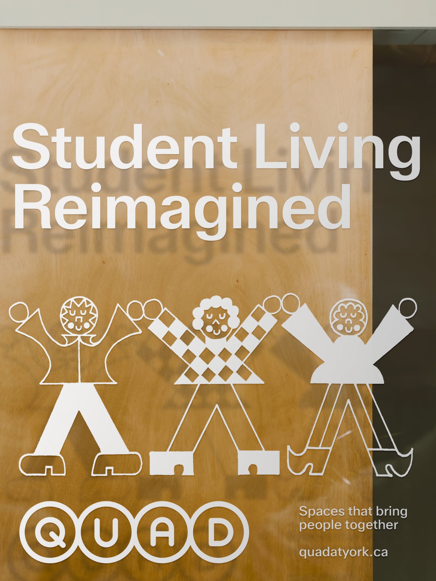
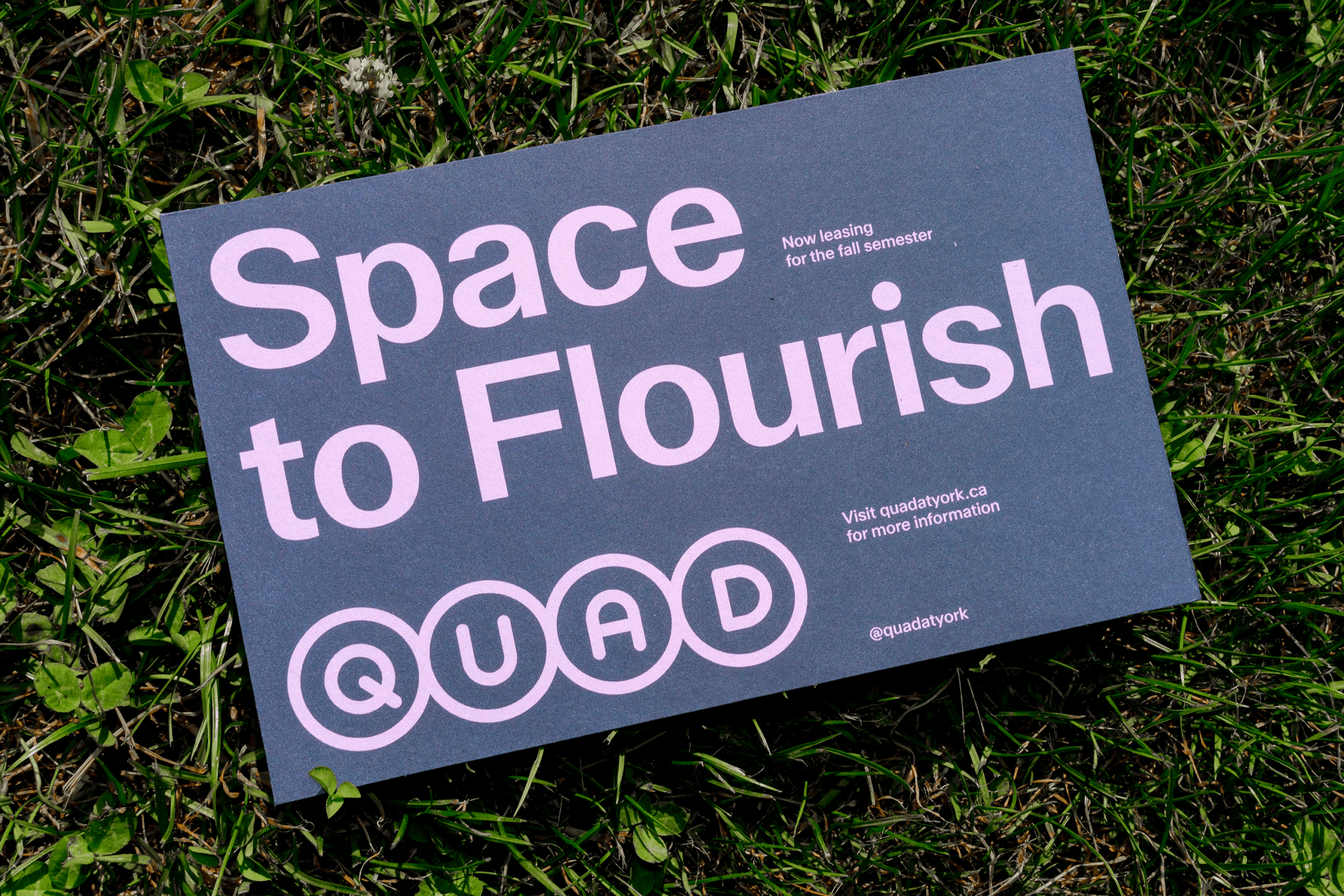
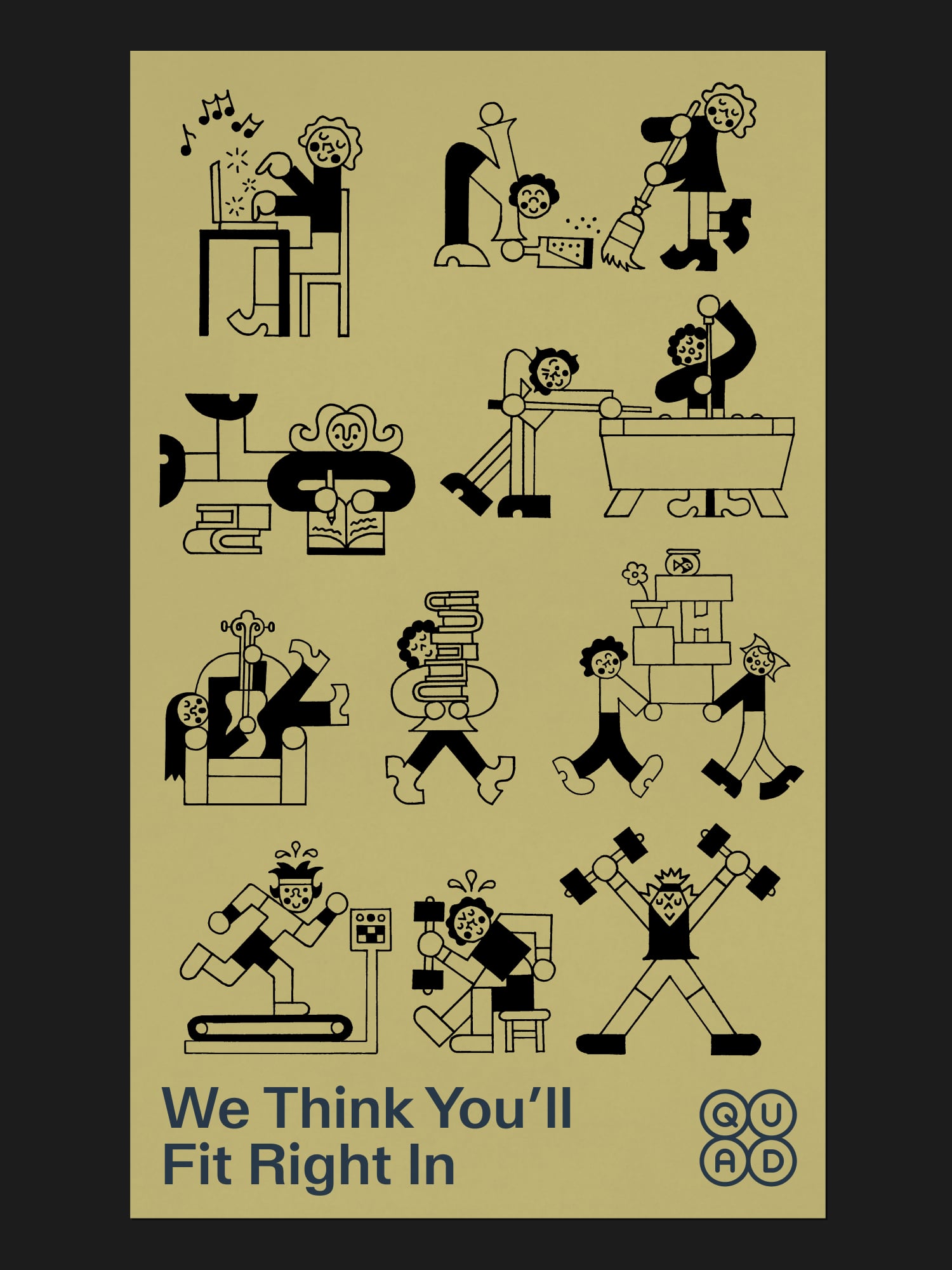
With a vibrant community in a safe, design-forward environment, Quad’s promise to residents isn’t merely a place to live; it’s space to flourish.